A CRO perspective: analyzing the differences between iOS and Android to get the best conversion rate for your app
- Monday, August 1st, 2022
- Share this article:

Romi Di Capua, a Junior CRO Mobile Analyst at Moburst, explains how to ensure your app is optimised for both the Apple App Store and Google Play Store.
 Mobile marketing is a whole world of its own, and there are two companies who are running the show: Apple and Google. While there are many similarities between the Google Play Store and Apple’s App Store, their features, regulations and guidelines differ quite significantly too. Understanding these differences can be the key to a strong conversion rate optimization (CRO) strategy.
What is CRO?
Conversion rate optimization refers to all procedures and techniques used to increase website or app conversions. To ensure your investment in CRO pays off in the long term for your business, it is important to have a step-by-step strategy that delivers results and does not require too much time or money.
New to CRO?
It will be easier if you break it down and think of it as:
- Listening to your target audience.
- Understanding your target audience’s pain points.
- Understanding your target audience’s job to be done.
- Explaining how your product will solve your target audience’s needs.
- The ideation phase of CRO becomes easier if you focus on the above.
CRO is about constantly testing different assets and improving conversion rates by detecting the best performing creatives and optimizing them.
Imagine you’re walking down a street full of clothing stores, and you decide to enter one of them to look at what they offer. The store wants you to become a customer and buy their clothes. The same goes for digital app stores – increasing the conversion rate (CVR) ensures that more potential users who see the app page will ultimately decide to install the app and become app users.
What are the main differences between Android and iOS?
- iOS users are higher value than Android users.
- The App Store is stricter and has more guidelines than the Google Play Store.
- Often, Android follows iOS when it comes to features.
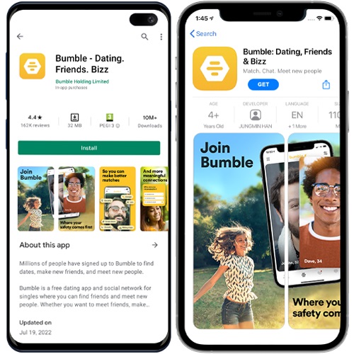
- Four screenshots are visible at a time on the Google Play Store, whereas only 1.5 appear at a time on the App Store.
- As a result, text is harder to see on Android due to the smaller screenshot size.
Which assets perform better in each app store?
It’s not an accurate science per se, but we have learnt a lot from our experience. We’ll dive into all the info below.
Screenshots
Which screenshots are the most important, and why? If we were living in a world where iOS was the only mobile software platform, we would invest most of our resources into the first two screenshots on the app page. That’s because your product page in the App Store shows only one screenshot in its entirety and half of the second screenshot. That’s it. However, we also have to consider Android, where Google allows the user to see four full screenshots on the app page. So we put our efforts into those first four screenshots too.
Displaying four screenshot frames in the Google Play Store in the same area size as one and a half screenshot frames in the App Store requires a significant reduction in the Android frame sizes themselves. So although on Google Play the user gets to see many more screenshots before scrolling, the contents are smaller and necessary visual adjustments must be made.
We’ve learnt that with Android, large devices, words and images in screenshots perform better because of the smaller screenshots. Cleaner designs also perform better on Android so as not to overwhelm the eyes in such a small screenshot.
There is disagreement as to whether Apple’s approach of enlarging the screenshot size and providing more space on the app page, or Google’s approach of reducing the screenshot size and giving the user more information about the app, is a better concept and which one provides a higher app conversion rate.
In terms of orientation, portrait orientation generally performs better in the App Store, whereas landscape orientation tends to perform better in Google Play Store.
For iOS, we recommend using an overlapping device or image on the first two screenshots to encourage users to scroll to see more screenshots. This is one way to get over the fact that so little screenshots are visible before scrolling. Another element that works well on iOS is showing a hand holding a device in the screenshots. It can’t be too large because that increases the risk of Apple rejecting the design, but incorporating a hand helps users feel connected to the app and envision themselves using it on their own devices.
For both iOS and Android, the messaging is hugely important. It can make a world of difference. Including convincing and engaging copy in the screenshots will inevitably attract more users. For example, adding some social proof in the first screenshot, such as the number of registered users or a positive review.
The types of recommended call to actions (CTAs) differ between the App Store and Google Play Store. Android marketers must avoid putting any form of CTA in the screenshots and preview video such as “Download now”, “Install now”, “Play now” or “Try now”. Otherwise, Google Play Console will reject the update. However, on iOS marketers can use these CTAs.
Video
Video appears differently on the two App Stores, just as with screenshots. How it appears exactly is dependent on if the video is portrait or landscape. We always A/B test to decide which video to use and whether the video gives added value to an app page or not. The videos are different dimensions on both platforms. 
The video specifications for the App Store are: minimum 15 seconds and maximum 30 seconds. Captions and narrations are allowed. You must only show USPs. The video will auto-play on mute. You can use graphical elements such as zoom, touch hotspots, and cutscenes. It’s best practice to use lifestyle images throughout the video.
The video specifications for Google Play Store are: minimum 30 seconds and maximum two minutes. It’s best practice to showcase your USPs in the first 10 seconds and show the user interface for at least 80 per cent of the video. It’s also important that the battery, wi-fi and cell service logos are displayed as full throughout. Google allows you to show Google Play awards such as “Best Of”. Best practice is also to keep the video short, prioritize the first impression by enticing users in the first three seconds, to tell a story, and ensure the video tempo is neither too fast or too slow.
The Google Play Feature Graphic is an essential asset in the CRO arsenal. A feature graphic is used as a cover image (which is referred to as a thumbnail/ poster frame on iOS). A play button will appear on top when there’s a preview video available. The feature graphic is also visible in other editorial sections of the Google Play Store. It’s crucial for a user’s first impressions as it acts as the first landscape screenshot on the Google Play Store and influences browse traffic. Testing and optimizing the feature graphic can help your app reach its highest potential and increase the CVR.
Icon
An app’s icon is the most valuable asset in both app stores. It appears in each event throughout the funnel: search page, app page and on the device after installing the app. It not only impacts the app’s CVR from impressions to installs, it also impacts the app’s retention rate because it’s what users see on their devices post install.
For small apps, changing the icon can re-engage users who haven’t used the app recently. For bigger brands, it’s better to stick with familiar colors for the app icon because it’s what users associate with your brand. When making changes, they should be minor and keep the overall essence of the original design to avoid disrupting the user flow.
In the Google Play Store, the icon is the only creative asset that can be seen in the search page, which makes it crucial for the CVR.
The icon colors, illustrations, fonts, imagery and sizes can all be tested to find the optimal one.
Metadata
Prepare yourself to reduce the metadata length in the App Store from your metadata length in the Google Play Store. Android gives you more space to present information on the app page. On the App Store, you can use only thirty characters in the app title and subtitle, whereas on the Google Play Store you can use thirty characters for the app title and eighty characters for the short description. What works on iOS does not necessarily work on Android.
How do you make CRO decisions based on the different elements within iOS and Android?
We recommend that each set of screenshots to be tested should represent a different concept. Each concept should be based on efforts to understand the user behavior and what makes users feel more connected to the app. Often, a sense of connection brings more app downloads.
After testing all of the assumptions and hypotheses, the data will inform the results. After the first round of A/B testing, it’s possible to optimize assets by changing creative elements or testing more concepts.
What are the best practices for Android CRO?
With each A/B test you learn something new. However, there are some common factors that help increase CVR on Android.
Since on Android the user sees the first four screenshots on the app page without scrolling, it’s important to prioritize the storytelling (and telling the right story) and showcase the main features within them. The rest of the screenshots are still important, but less users will scroll to see them and they don’t contribute to users’ first impressions either.
If the screenshot is landscape, the user will only see the first frame in full. It’s relatively small so it’s important to highlight the main features there. In general, the statistics show that landscape orientation works better for Android and encourages more users to install the app. It’s less cluttered to the eye and more intuitive to look at one wide screenshot over four thin ones.
Best practices involve keeping the design simple and clean, using large captions, making any devices or images big, and using clear images that will stand out to the user.
What are the best practices for iOS CRO?
Just like with Android, it’s important to show the main feature of the app on the first screenshot since this is the one users see without scrolling. We also always recommend that everything shown within the screenshots is big and easy to see.
Keywords are important in the metadata of iOS apps, but including them in the screenshots won’t necessarily help the app rank for them. However, the fact that those keywords appear in the screenshots helps to attract users.
It’s a popular method for apps to put their positive ratings and reviews in their screenshots on the App Store.

Want more like
this to your inbox?
Popular topics
You might also be interested in