Here are four great examples of A/B testing to take inspiration from
- Tuesday, April 16th, 2019
- Share this article:

When it comes to digital marketing, A/B testing can be a great tool to increase revenue, boost social media engagement, and improve conversion rates. When a business uses A/B testing, they simply test two different versions of a page on their website, and then see which version attracts a larger audience or better sales results. Here are some examples of A/B testing and strategy that worked for a diverse selection of companies:
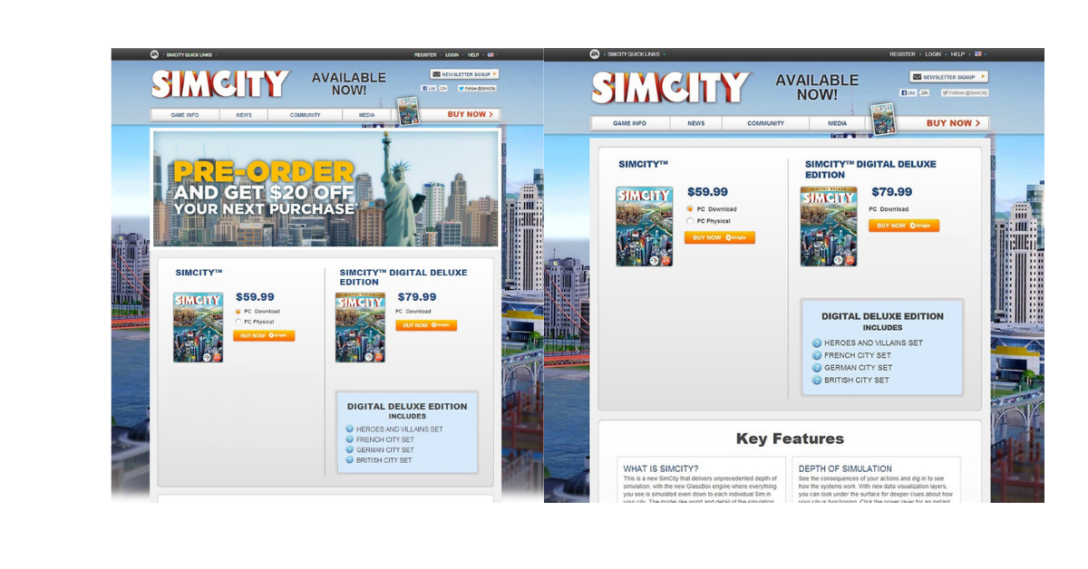
1. EA Games: SimCity
When game developer Electronic Arts wanted to promote its pre-order for SimCity5, the company decided to add an extra incentive for buyers. EA included a banner ad on its pre-order page, which offered consumers $20 off their next purchase if they pre-ordered SimCity5. To EA’s surprise, the additional promotion did not drive pre-order sales.
EA decided it was going to alter the pre-order page and remove the $20 promotion completely. The page with no offer saw an increase of 43.4 per cent more purchases. SimCity5 ended up selling 1.1m copies in its first two weeks, with 50 per cent of those sales being digital downloads.
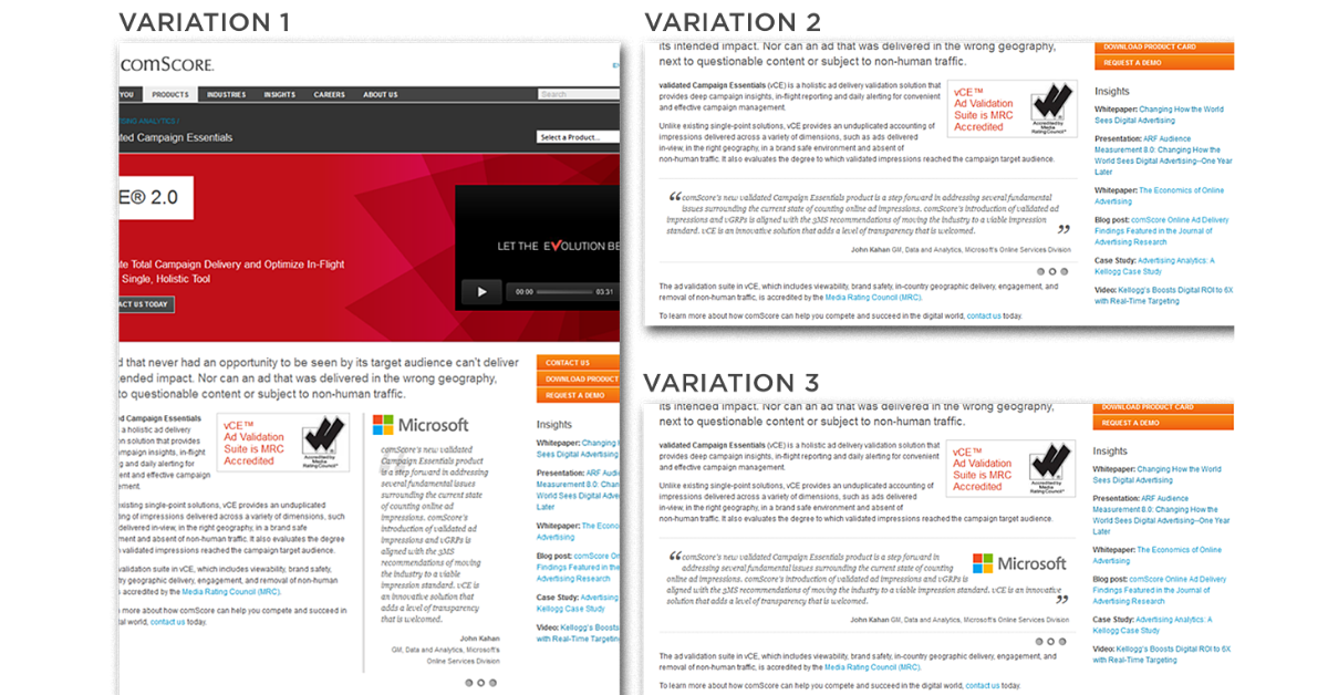
2. Comscore
Comscore, a digital measurement and analytics platform, wanted to use social proof to drive new leads for its sales team. To do this, Comscore inserted customer testimonials into each of its product pages. Originally, Comscore set up the quotes vertically, with a grey background and quote attribution at the bottom. It turned out that this tactic wasn’t eye-catching enough for possible new clients.
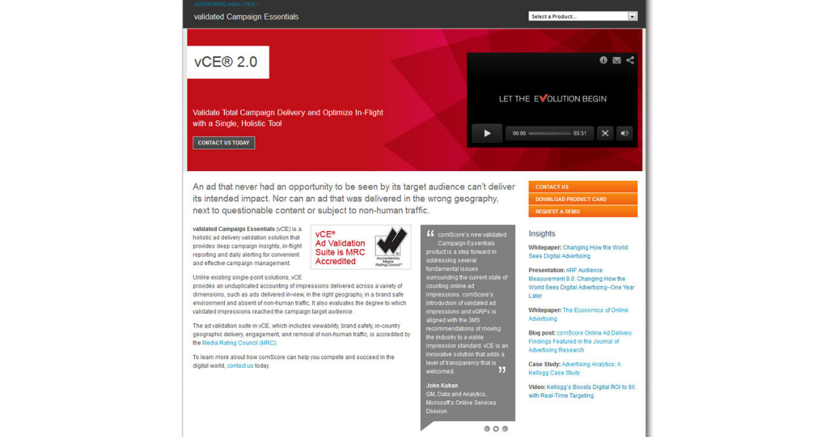
Comscore’s director of web marketing, Ferry Gijzel, decided to create multiple variations of the original product page, changing the layout and imagery around the customer quotes. Ferry deleted the grey background and added a variation of the customer logos within the pages. He also tested if horizontal or vertical quotes appealed more to his audience.
After testing 2,500 website visitors, Variation 1 was the clear favorite, using a vertical layout with the client logo placed at the top of the quote. Variation 1 increased the conversion rate of the product pages by 69 per cent, compared to the original product page layout.
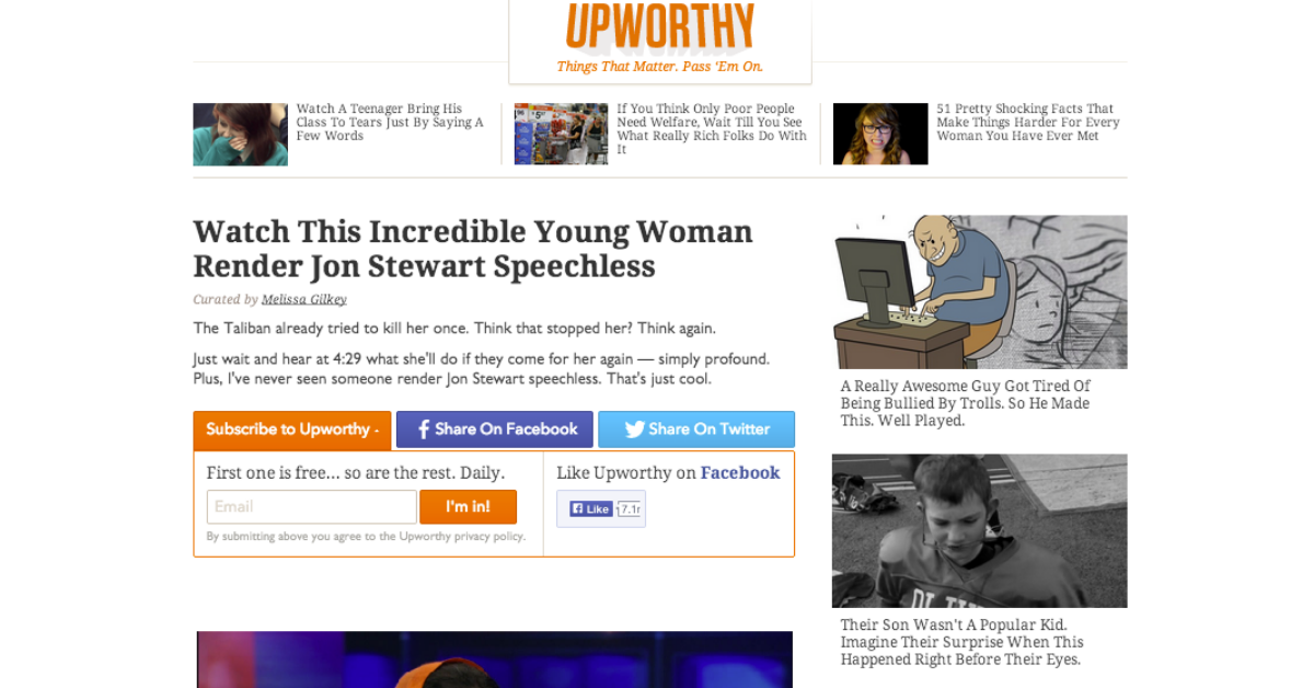
3. Upworthy
Upworthy, which houses viral videos, wasn’t happy with how much engagement and social shares its content was getting. In order to make the website more shareable, Upworthy added recommended and related content modules to its different pages. For only a few days, Upworthy continued to test a variety of different placements and designs for its recommended content modules.
The end result? The best performing variation of the recommended content module increased social sharing by 28 per cent and improved the sites overall engagement. Upworthy immediately implemented the new recommended content tool into every page on its site. 

4. WallMonkeys
WallMonkeys, an online retailer of wall decals for homes and businesses, wanted to increase clicks and conversion originating from its homepage, which featured a basic stock image, search bar and headline.
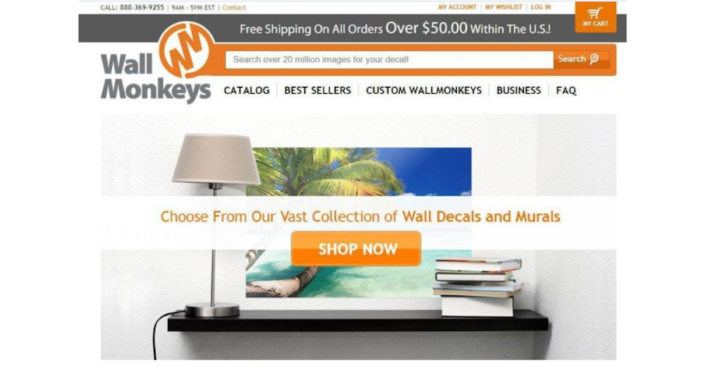
To see which parts of the homepage customers were focusing on, WallMonkeys used a Crazy Egg Heatmap. The Heatmap showed that most of WallMonkeys online traffic was gravitating towards the headline, CTA, logo and search and navigation bar.
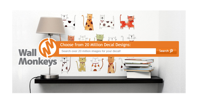
WallMonkeys decided to change the basic stock-style image to a more adventurous design, which yielded a 27 per cent higher conversation rate than the original photo. WallMonkeys then continued to make variations, including replacing the headline slider with a search bar. The second test resulted in a 550 per cent increase in their conversion rate.
Watch the video below on A/B testing
These are great examples of how A/B testing within online marketing can impact your business. Whether youre trying to increase revenue, make your website more sharable, or improve conversion rates, there are endless testing variations that can help you reach your specific goals.

Want more like
this to your inbox?
Popular topics
You might also be interested in